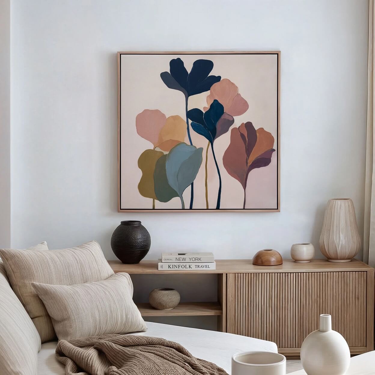
I used to think that decorating with Minimalist Wall Prints meant expensive prints from curated shops or something you needed a design degree to pull off. Turns out, it’s the opposite.
Minimalist wall prints are one of the easiest, most forgiving things you can create yourself. And once you start, it’s hard to stop. The prints have a way of transforming a space without overwhelming it, adding personality while keeping things calm and uncluttered.
In this post, I’ll walk you through simple, approachable ways to design and create your own minimalist wall prints, even if you don’t consider yourself “artistic.” Think of it as a less strict how-to guide and more like a friend sharing ideas you can try at your own pace.
By the end, you might have a few beautiful pieces ready to hang and a space that feels a bit more like home.
DIY Minimalist Wall Prints: Step-by-Step Guide
Feel then Design
Before you open any design app or pick up a pen, pause for a second. What do you want your space to feel like?
Is it calm and airy? Grounded and warm? Or, do you want a little playful but still clean wall decor?
Minimalistic wall art works best when the aim is both decorative and a mood-setter. For instance, a soft abstract line drawing feels completely different from bold black typography, even if both are “minimal.”
Sometimes you feel stuck. During such moments, you need to step back and look around your room. Your furniture, your textiles, even the light at different times of day, will tell you what belongs where.
The key here is to start with how you want your space to feel rather than what you should make.
Choose a Simple Concept and Commit to It
After you’ve decided what you want, select a suitable, simple concept and commit to it fully.
As you do this, keep in mind that Minimalist Wall Prints usually fall apart when we try to say too much at once. This is when restraint becomes your secret weapon.
Therefore, pick one idea and let it breathe. That could be:
- A single-line drawing of a face or plant
- A short phrase or word that means something to you
- A geometric shape intentionally repeated
- A soft abstract form in muted tones
The examples I’ve given above are from a personal experience. Some years ago, I combined typography, shapes, and textures into a single print. Although it didn’t look terrible, it felt somehow busy and confused.
But when I stripped it back to one bold word in a clean font, everything fell into place. And that’s when I learnt that a wall print doesn’t need any explanation, if it does, it’s probably doing too much.
Use Readily Available, Easy-to-Use Tools
Making your own minimalist wall prints doesn’t require complicated software to make it beautiful.
If you like working digitally, consider apps like Canva for assistance and motivation. Even the most basic drawing tools are more than enough. With clean templates, simple shapes, and good typography, your options are limitless.
If you prefer something tactile, grab paper and a pen. Scan it later or photograph it in good light. Don’t worry about slight imperfections on your art. These often make it feel more human and less “template-y.”
The key is choosing tools that feel easy. When the process is simple, you’re more likely to experiment, and that’s where the best ideas come from.
Pay Attention to White Space
This is where minimalism really earns its name.
I used to take white space as a blank space that requires filling. Until I learnt that in design, it’s just as crucial as any other item- a breathing room. It’s what makes your design feel carefully thought out, not cramped.
If you’re designing digitally, resist the urge to fill the page. Let your subject sit comfortably with space around it. If you’re drawing by hand, place your element slightly off-center and see how it feels.
A good trick is to step back and look at your print from across the room. Does it feel calm or cluttered?
If it feels crowded, it’s time to remove something.
Pick a Color Palette That Feels Cohesive
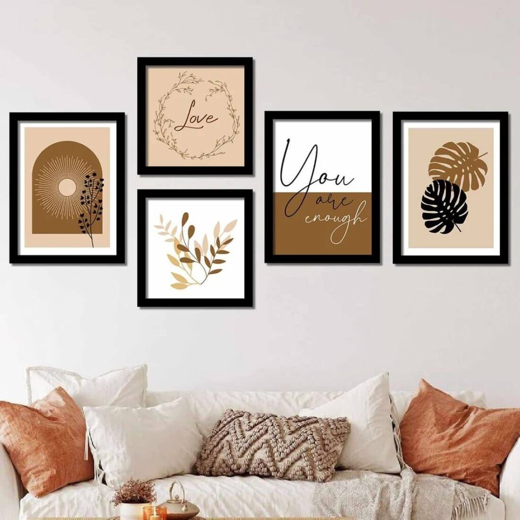
Minimalist wall prints need few colors. Therefore, choose the ones that matter.
Black and white is always a safe starting point. It’s timeless and works in almost any space. From there, you can introduce one or two muted tones, think soft beige, dusty green, or warm terracotta.
Try to echo those that are already in your room. That’s what makes a print feel like it belongs instead of floating awkwardly on the wall.
I like to limit myself to two or three colors max. It keeps decisions simple and the final piece cohesive.
Give More Attention to Typography
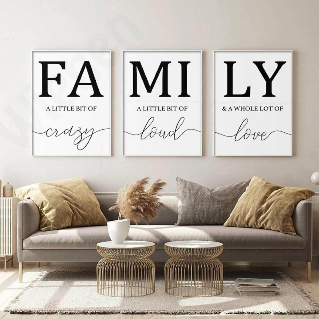
If you’re creating text-based prints, your font choice is everything.
A clean sans-serif font feels modern and understated. A serif font adds a bit of elegance. Although handwritten styles can feel personal, they need to be used carefully to avoid clutter.
Spacing matters as much as the font itself. Hence, adjust letter spacing and line height until it feels balanced.
And keep your message short. One word or a short phrase usually hits harder than a full sentence.
Go for the Best Print Quality
You can design the most beautiful print, but if it’s printed poorly, it won’t land the same way.
In this case, use thicker paper if you can. Consider matte finishes because they work better for minimalist designs than glossy ones. They also feel softer and less reflective.
If you’re printing at home, test a small version first.
Tip: Colors differ on paper from those on a screen.
On the other hand, if you’re going to a print shop, ask about the paper options available. It’s a small upgrade that makes a big difference.
Framing is Part of the Design
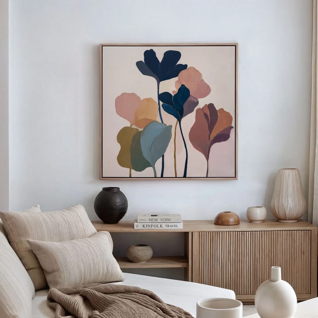
A minimalist print feels complete with the right frame choice. Simple frames work the best.
Consider thin black, white, or natural wood but, but not ornate. Let the frame support the print, not compete with it.
Also, consider adding a mount or a mat. That extra border of white space can elevate even the simplest design.
Then hang it at eye level, or slightly lower for a more natural look.
Let Yourself Experiment Without Pressure
Here’s the part people say less. Your first few prints might not be great. And it’s totally fine that way.
Minimalism may seem effortless, but getting there takes a bit of trial and error. You’ll tweak spacing, change colors, scrap ideas halfway through.
That’s part of the process.
The upside is that these prints are low-stakes. You’re not investing in expensive materials. You can try again tomorrow with a fresh idea.
Conclusion
The quiet power of art lies in the satisfaction and pride that come with making your own Minimalist Wall Prints.
Looking at your wall and knowing you made what’s on it is a priceless achievement. Not because it’s perfect, but because it feels like you.
Minimalist prints are about creating small moments of calmness in your space, not about impressing anyone. And once you start seeing your walls as something you can shape, edit, and refine, decorating stops feeling overwhelming.
So, you don’t have to live in a space with boring blank walls just because you don’t know what to do with them.
You can also borrow some ideas from the article I wrote earlier about wall art ideas for blank hallways for a more charming and personalized touch.