Do the colors on your wall have the capability to influence your mood? Colors can be connected to our emotions. They do have a great influence on human minds. While decorating your dream home or office, it is necessary to have an understanding of what colors you should choose and how they are important.
Interior design is all about expressing yourself.
You can choose colors and designs that reflect the feeling you want that room to create. Let us see what color psychology is and how it plays an important part in interior design.
Can colors communicate to our minds?
Yes, they can. Colors can determine moods and evoke certain emotions in our subconscious. Some colors can increase our blood pressure and strain our eyes. Whereas some other colors calm the mind and create a peaceful atmosphere.
So you have to research well, before planning to change the hues of your room or office. A little detail can make so much difference! In today’s post, we’re going to discuss everything you need to know about colour psychology in interior design.
We will tell you what magic each of these colors can create. You can select the one which perfectly matches your aesthetic.
The psychology of colors is scientifically proven and tested. There are warm colors that make you feel active and cheerful. Cool colors will make you feel comfortable and soothes down your mind. There are also neutral colors which makes a balance between these two.
Let us see the psychological qualities of each color.
How to Use Colour Psychology in Interior Design
1. The iconic Red
Red is one of the passionate choices you can go for.
The color speaks for itself. The solid red is a vibrant color that brings out emotions like love, and joy. It also represents determination and courage. If you are planning to decorate an office room, red can make the room look more cheerful.
There will be a sense of leadership, class, and seriousness in a red-painted office room. Dark shades of red are compatible for bedrooms to show deep love.
As much as it is a color that resonates with love, red can also raise blood pressure. To avoid this, you can try using a mild and cool tone along with the red. The two colors will contrast each other and create a balanced tone.
2. The relaxed Brown
Brown is a laid-back neutral color. It is the best choice for homes and personal spaces. It gives the feeling of comfort, reassurance, and safety. Brown goes really well with the idea of a cozy home.
It gives a modern and classic look to the living rooms.
If you decorating a huge room, Brown will make it look cool and comfortable. But if the comfort is too much, people will tend to be lazy and inactive. So brown might not be the best choice for creative workspaces. Brown can be used in both living rooms and kitchens.
It brings a state of stability and timelessness to the inhabitant’s mind. Brown is also great for garages and workshops because it has a rugged look.
3. The lively Orange
Orange, without even a doubt, is a happy color. It belongs to the spectrum of vibrant colors.
The color of the sunshine, Orange has closely associated the idea of young and dynamic. Orange is not as serious as red. It also has a funky vibe on it. Orange symbolizes success and prosperity. It evokes feelings such as happiness, liveliness, encouragement, determination, etc.
There are different shades of orange which you can try. If you want a wealthy-looking room, go for shades like gold. Other than walls, orange looks great on furniture too.
If you are expecting a cool and high-spirited creative workspace, orange will not let you down. In bedrooms, orange is mostly preferred by youngsters than older people.
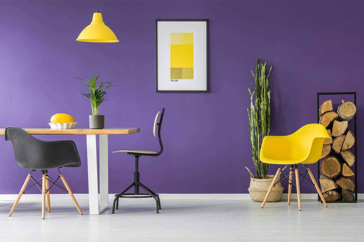
4. The happy Yellow
Yellow is another pretty cousin of Red and Orange. It creates a fresh and new vibe in rooms.
The color lights up the room and brings a feeling of joy. You can redecorate your rooms with yellow to get rid of the boring look. Yellow can make people talk more and be present with a bright personality. It is an optimistic color.
But yellow can create bad images of sickness and sometimes lose temperament also. Make sure to use darker shades to avoid this feeling.
Decorating a room completely in yellow will be not favorable for your blood pressure. Mix it with white or other cool tones to balance the look. Yellow might be more suitable for the workspaces like a kitchen than the living room or bedroom.
5. The fresh Green
The green color brings the freshness of nature to your room. It is pleasing to the eyes and at the same time gives a powerful vibe too. Green is popular in interior design because of its calming effect on people’s minds.
Green symbolizes growth and peace. You can decorate with dark green plants to bring a piece of nature to your room. It creates a feeling of harmony between nature and man.
Compared to red or orange, green does not stress the eyes so much. So it is preferred to create a relaxing and secure atmosphere.
6. The calming Blue
Blue symbolizes sky or ocean, therefore it brings a calming effect in people’s minds. Blue doesn’t depress people or make them feel negative. It evokes feelings such as bliss and tranquility. Blue is also a serious color with positive effects.
It will be ideal for both offices and houses. It wouldn’t be the best decision to use dark blue in small rooms. You can use white or any other light color to balance the tone. Darker shades like cobalt and navy blue go well with big rooms.
It brings a feeling of confidence. For a homely feeling, lighter shades are the best.
7. The classic Black
If you are thinking black will make your room look gloomy and dull, that’s not completely true. An all-black room might look depressing but if you pair black with white or other colors like gold, the room will look classy.
Black interior design will bring a versatile and unique look to the room. It shows the power and high class. Black is well-loved by modernist interior designers.
8. The peaceful White
The white color makes an appearance in almost all the interior design plans. It helps you to neutralize the effect of dark colors. White is for the people who love simple designs.
This colour is a great choice for people who are strict about cleanliness. It brings a feeling of peace and reduces blood pressure. If you are claustrophobic, painting the walls in white will provide you with a sense of security.
9. The pretty Pink
The first thing that might come to your mind will be the feminine nature of pink. Pink is a great color for teenage girls’ rooms.
Pink is mostly loved by women and girls but it can also show a masculine side when used wisely. You can pair pink with natural colors or bold red and white tones to create a different effect.
It aids in reducing feelings of grief. Pink symbolizes warmth and sweetness. It can also be utilized to create a joyful and blissful mood in the living room and bathroom. When coupled with secondary hues like light blue, vibrant pink tints like Magenta, Fuchsia, and others speaks a lot.
You can use them to bring fun on wall patterns.
10. The royal Purple
Purple has the qualities like elegance and a look of luxury. Purple may be used in dressing rooms, walk-in closets, in-house art studios, and even the kitchen since color promotes creativity.
This hue is especially popular among adolescent kids since it encourages them to pursue artistic and performing arts and assists them in determining their careers. Purple is commonly associated with grandeur and elegance.
Its color palettes perform effectively in settings where creativity and design are encouraged. In bright colors, such as violet or plum, bring interest to any design plan.
Lighter purple tones like lavender and mauve, on the other hand, produce a tranquil but royal look in your design. Purple’s elegance works well in the entrance or living area of your house.
Conclusion
Now you know why you feel blue in certain rooms and immediately feel an enthusiasm entering another room. Interior designers spend a lot of time researching before choosing the color palette for you.
If you know what these colors try to tell us, you can redecorate your room in your own style. Color preferences change according to the age of inhabitants. You can also try decorating different rooms in different colors.
It also depends on one’s attitude towards life.
If you are suffering from loneliness or depression, choose green or blue to calm your mind. If you have a sunny personality go for happy colors like orange or yellow. For workspaces, you can experiment with red and black.
Comment below your experiences in interior decoration and which color suits your style.
Resources